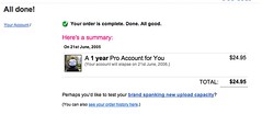
flickr UI
Originally uploaded by bigyahu.
In my experience, websites benefit from having a consistent editorial voice (the copy on the website reads like it's always the same person, in the same voice.) This helps the visitor identify with the "people" or company behind the website.
A consistent editorial voice can (sometimes unintentionally) polarise visitors into "I like the 'people' behind this website" and "I don't like the 'people' behind this website", but it can also be used to make the broadest possible audience feel 'at home' and comfortable, if done right.
One of my own attempts at this is the Terms and Conditions page for HomeScreen. I wanted visitors to feel comfortable about entering into a monthly credit card subscription relationship with this company they'd never heard of before; and I wanted to make it feel like HomeScreen was a company that knew how to smile.
The T&C page includes a few light-hearted bits, especially towards the end. The privacy policy (which I assume absolutely nobody ever reads) has a few, even one right at the beginning, to reward anybody who actually bothers to read the page.
Unfortunately, there aren't enough editorial text opportunities on HomeScreen to keep the editorial voice front-and-centre because the site is all about quickly and easily choosing DVDs to rent. There have also been many, many 'chefs' involved in this particular soup over the last three years, so the voice isn't so much consistent as verging on multiple personality disorder.
One site that does a great job of creating an open, welcoming and funny editorial voice and then keeps it consistent is www.flickr.com. This screen dump shows how Flickr has taken something dry and functional and added a little personality to the page.
Many businesses would have legal and finance people all over a page that confirmed a successful credit card transaction like this, and they would be carefully (and needlessly) removing all trace of personality and charm, lest it be used as evidence against the company one day in court proceedings.
I've seen it happen many times before - you brief a lawyer to check that one particular part of your website is OK, and once they've finished, they decide they better make sure that the rest of your website is up to the same diamond-hard legal standard. Before you know it most of your website reads like a contract, and every second word gets a superscripted asterisk or greek character, referring to a mountain of small print bigger than the copy it refers to.
Either Flickr has some cool legal and finance people (which is as likely as rain on the Moon, but is nevertheless theoretically possible) or those people don't get to run amok and surgically remove all the personality from the site. Either way it makes me love Flickr all the more.
I don't think we should run out and kill all the lawyers, by the way. Though if some way could be found to make them wear ID tags, corral them in one place, perhaps with razor wire, german shepherds and spotlights... it would primarily be for their own protection, of course...


