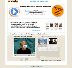
New scouta.com Mockup
Originally uploaded by rich115.
Richard Giles from Scouta was looking on Twitter for some feedback on his new redesign. I charge for this kinda work, but here's some brief feedback:
S-P-E-L-L out the benefit
You haven't yet shown the user the benefit. You assume they know why receiving personalised recommendations is a good thing. Start with, "Who has time to find good stuff to listen to/watch online?..." and explain the benefit. Most consumers still aren't aware of what recommendation is, much less why it matters to them.
Who's your target audience?
It's really hard to get a good balance between the consumer target and the media publisher target, so why try? It just clutters and confuses to have a message aimed at publishers wedged in-between two consumer messages. Just put a button-shaped link near the bottom that says, "Are you a media publisher?" and take the publishers to another page. We media publishers are smart, we're better at retention when scanning a page than joe consumer.
What's your brand?
You've got two competing brands on the page: the "scouta" text and the whirly play button, which is really your chicklet - what should be small, subtle interface cue used before links, instead of player play buttons, etc. Which do you need the user to really recall? I'd suggest it's the Scouta logo.
Not all ratings are equal
Are you sure you want to collect user ratings on content right from the homepage with no prior Learn More or new user registation? Before they've really invested in the idea that rating things well delivers good recommendations? Having worked on content recommendation products before, not all user ratings are equal. I'd expect these ratings would be next to useless in this context, and aren't likely to give the user a positive result - they're going to expect a perfect recommendation after the first rating click, or click both of them to see what happens, or worse.
When it doesn't work as they expected (because you haven't yet told them what to expect) their simple little mind will come to the end of their tiny little attention span, they'll click off your homepage and whatever you paid the SEO to get them will be wasted.
CaPiTaLiSaTiOn!
I'm Not A Big Fan Of Capitalising Words That Aren't Actually Proper Nouns ;-) When The Whole Page Uses Them It Doesn't Focus The Eye, Instead It Decreases Readability Significantly.
25% OFF! Oh wait, it's free...
Love rosettes for highlighting 'special deal' info, though they tend to get ignored by users not interested in clicking on advertising links. They're not very 'with it' anymore. If you must use one, consider one with fewer points. If you're not wedded to a rosette but still want visual impact, nothing says "Ideal for iPod, iPhone and AppleTV owners" better than a pic of the products all nicely arranged together with some dramatic lighting and a zushy background.
Black on orange isn't kind on eyes, and, uhh... were you happy with that font?
Love the promise of personalised content recommendations, keen to see how the new site looks when it goes live! Hope that helps!


