Last year I wrote something of our experiences driving in India for carsguide.com.au but in typical newspaper publisher fashion the story is no longer available on carsguide (the 'long tail'? what's that?')
Thursday, February 28
Come drive the eroding roads!
Amazon's international billing problem
Met Mike Culver, web services evangelist for Amazon's S3 cloud services today on his first trip downunder. All this cool stuff about how we can base an entire startup on a pay-as-you-go storage and computing model with the same reliability and speed as Amazon itself.
Mainly technical discussion, so a lot of it way over my head but one of my questions hit home:
If Amazon's charging me in USD and only accepts credit card payment, the foreign currency exchange fee my bank is going to charge me is a big hit. My bank's 3.3% for Mastercard and 3.4% for Visa foreign currency transactions is probably standardish.
Mike hadn't come across that before but seemed serious about taking that issue back to the US to get solved.
Not as big an issue for me personally as having no amazon.com.au, but prolly enough to make such a variable cost unaffordable here.
US companies still aren't great at the whole international product strategy.
(btw, no links or image with this post because iPhone STILL doesn't support copy & paste grrr)
[Sent from my iPhone, still unable to copy and paste and it's 2008]
Wednesday, February 27
To emoticate or not? Psyblog sez yez
I'm a professional communicator, and thanks to the remote business relationships I maintain online, a lot of my communication is in writing. So I'm very interested in studying how written communication is changing thanks to the influence of the interweb.
A few years ago there was the migration of emoticons from instant messaging and SMS to casual online relationships, eventually appearing in mainstream marketing and even business communication.
At the moment I see people beginning to adopt the all-lower-case capitalisation seen in microblogging and social networks, and the 'signature' - the end of your message where you leave your name as you would your handwritten signature on a letter - is going out of style. Don't even get me started about people who use 'lolcat' phrases...
Just because new styles are adopted doesn't mean they're widespread or permanent - you don't want to be the last person in your peer group to still be typing "lol" when everyone has moved on to "lolz". Just as saying, "OK" instead of "I understand" changes how you're perceived in a verbal discussion, these non-verbal cues you use will affect how you're perceived in a written discussion.
I found this post on PsyBlog when reading Kate Carruther's blog - the results of a study on the effects of using capitalisation and emoticons are both expected and surprising.
As I expected, correctly capitalising what you write improves the reader's perception of you, but while I thought emoticons would have the reverse effect, they also improve the reader's perception of you. CEOs of Australia, start using smileys!
Don't use them when communicating with software developers though, since the study also found that the effect of capitalisation and emoticons was minimal or even reversed when read by introverted and emotionally unstable people.
I've subscribed to Psyblog. Goin' psycho!
Imitation, sincerest form of flattery

Imitation, sincerest form of flattery
Originally uploaded by thatjonesboy.
Wow, that new Y! Buzz logo sure looks a lot like bluepulse.
my first ASCII spam! how old skool!

my first ASCII spam! how old skool!
Originally uploaded by thatjonesboy.
I've never seen an example of ASCII spam before. I want to reply with an ASCII pic of a girl in a swimsuit, or a Lamborghini - one of those classic ASCII art images of the 80s, but I know I shouldn't.
Tuesday, February 26
Death of social networks? Not that way, and not yet!
 Mark Jones of Filtered Media is predicting the death of social networking. I don't think death is coming any time soon, and certainly not from Google and Gmail as Mark suggests. I think the bigger future threat for MySpace and Facebook are microblogging and social messaging layers over the top of the social networks.
Yes, social networks can't sustain the current growth. There will be a plateau. Following the plateau will come more realistic valuations, rationalisation and acquisition by the networks.
Yes, to some extent social networks will atomise - social networking platforms are already starting to blend in the features of other web platforms via their APIs and developer platforms, and it makes sense that some of that platform functionality will bleed out into email, search, blogging and other web platforms over time.
The 'friend spam' we see now on Facebook is a function of the immaturity of the social network businesses themselves, which are still learning how to manage open platforms, and to some extent a learning process for users - it's already unfashionable to be the friend who sends too much social network spam - soon, it will be social suicide.
I can't see Mark's 'Email 3.0' spelling the end of social networks. If I were an 18-25 year old, why would I need to wrangle with Hotmail and Yahoo! Mail if I can use Facebook's email to stay in touch with everyone I know? Hotmail spam vs Facebook spam? Give me the latter any day.
Why would I need to search from the Google homepage if Facebook was my homepage and I could launch a Google search from a Facebook app in my profile page?
Google's become the default for us 30-40 year olds, and Yahoo! is the default for our parents, but Facebook and MySpace have an opportunity to be the default starting point for our kids. ...if they seize the opportunity and execute well, which so far they have had trouble with.
Email is inherently a functional product - I need to have something to communicate to someone before I send an email. However social networks work best when I can use them as inspiration for finding something to say to my friends. I may not have any news myself today, but by browsing what my friends have been up to recently, there's always something that I can comment on, criticise, debate or LOL at.
Social networks will remain a place that people go to 'hang out' with their friends and meet new friends online. There will be fewer of them in the future, and the big ones will probably be owned by larger networks as MySpace is now.
But just as social networks have an opportunity to steal the email, search, media sharing and buying/searching eyeballs from the incumbents, there is already a couple of threats to the social networks: social messaging businesses like bluepulse (who are more comfortable if I disclose that I'm contracting for them any time I mention their name online, bless 'em!) and microblogging services like Twitter.
Social messaging businesses threaten social networks because they may steal away the user's all-important 'status message'. Without the status message being updated there's half the value of the Facebook newsfeed gone, and the newsfeed is everything to Facebook's business. If I can more quickly and easily update what I'm doing now from my mobile phone on bluepulse than I can on Facebook, then sure, Facebook may lose me (that's "me the hypothetical 20 year old" not "me the 43 year old".) Facebook's mobile product is still lame: you can't sign up as a Facebook user from a phone, and many of the key features are missing from the mobile product. Using MySpace's mobile product is like travelling back in time to 2000 and back in space to Boondocks, Carolina. I don't see any sign that Facebook or MySpace 'get' the importance of building a better mobile product yet.
Microblogging services like Twitter can also steal away the status message traffic and user loyalty from the social networks, by making it all about status messages, and then using the social network's own APIs to let the user update multiple social networks from one spot, saving time and money, both very precious to 18-25 year olds.
at
Tuesday, February 26, 2008
View Comments
![]()
Labels: facebook, myspace, product, social networks, strategy
Thursday, February 21
Bluepulse chosen as an awards finalist. Does it really matter anymore?
Bluepulse (for whom I'm contracting at the moment) has been chosen as a finalist in the grand-daddy of tech award events, the SIAA 2008 CODiE Awards. Here's the press release and Bluepulse's announcement.
Generally, I'm cynical about industry award events these days. There's so many of them. Some seem like thinly-veiled pats-on-the-back for friends and clients. Instead of being selected, you have to lobby yourself, so that to even get on awards list radar, you almost need a dedicated person working on award entry submissions.
Here are a few problems and suggested solutions for technology awards events. Feel free to ignore them and keep having a wild time with your best clients at your next awards:
You entered? You win!
You've been holding your awards at the same time each year, but with all the competition from other awards, you realize you're a month out from award night and some of your categories don't even have entries yet. You get on the phone and call some friends, "get your entry in and I'll see what influence I have on the judging panel" (translation: you'll win because you're helping make our awards look less lame.) Solution: have judging panels select the entrants in each category, rather than asking companies to submit themselves or accepting 'nominations from customers' (which inevitably will be submitted by PR people). It's tough to get judges to do that much work, but it's worth it.
Who's the judge?
In some awards events nowadays, the selection is done anonymously by the company managing the event. Any time I see an awards event and can't find out who the judges were, I have to wonder whether there's any conflicts of interest, especially when the organizer earns revenue from consulting to - or running advertising for - some of the nominee companies. Best practice: full disclosure of the judges, their qualifications, and the judging process itself.
What's 'finalist' really mean?
Related to the previous problem. A little later on in this post you'll read me getting excited about a company I'm associated with being selected as a finalist in an industry award event. Well, partly I'm excited because it's a big, big award, and partly I'm excited because I have some appreciation of what a company has to do to be chosen as a finalist. Unfortunately, that's not usually the case. I'm not saying I think being nominated as a finalist is entirely worthless, but it's newsworthy these days, without the news including any detail of how your company or product was chosen as a finalist.
I saw some awards in 2007 where the judging panel selected a small number of finalists from a pool of hundreds of nominees and I also saw more than award where I suspect F=N-1 (do I need to spell it out?)
Best practice: full disclosure when announcing your finalists. How many entrants were there in that category? How were finalists chosen? How tough does your organisation believe it is to be selected as a finalist?
Did I mention Bluepulse is a finalist? ;-)
So how does the 2008 SIAA CODiE Awards stack up against my criticisms? Am I able to diss the entire tech industry awards biz while mounting a convincing case that the CODiEs are an exception? Yah, I think so.
The CODiEs have been running since 1986. 1986! Was there even an internet in 1986? That depends on how you define "internet" but there were certainly no internet awards in 1986, and I was busy chatting on CompuServe and downloading pics of Playboy centrefolds (when 'raunchy' meant 'nipples') in glorious greyscale from my local BBS. Award winners that year included Microsoft Excel and Aldus (pre-Adobe) PageMaker. Microsoft Windows won Best User Interface. I know, that seems nuts, but that's because we have the benefit of hindsight. Back in the day, Windows really was a significant advance.
But don't lose sight of the fact that, just in 1986's winners, CODiE picked the operating system that defined the personal computer industry for the subsequent thirty years, the software product that still counts 9 out of 10 dollars earned and spent, and PageMaker, which created the desktop publishing industry and set many of the conventions of graphical user interface design. That's a heck of an all-star cast. When Bluepulse has the goal of changing the way the world communicates, being nominated in that kind of company is significant.
True, in these self-service days, you have to enter your own company for an award, but the SIAA goes to a lot of trouble to source a large software industry judging panel to do the winnowing out of finalists, and then puts the awards themselves out to vote. Not an open vote allowing the entire staff of your PR agency to vote for you, either. Only SIAA member companies in the relevant category get to cast a vote - so you are literally voted for by your peers (and no, your PR agency can't become a voting member of the SIAA.)
Finally, the SIAA is a "software industry association" not "a web 2.0 blog publisher". Not only do online products have to compete with other online products to be nominated, you're also up against what old fogies like me still sometimes refer to as "real" products - stuff that in many cases ships on a disk, with a printed manual, in a box covered in feature bullet points, minimum system requirements. That's some serious competition.
So yes, despite the parlous state of tech industry awards, I think Bluepulse making it to the finals of the CODiEs is a big deal that we should all be excited about. This nomination is recognition that, fundamentally, Bluepulse is good at software development; that they can mix it with the best when it comes to the code. That's what we'd all want to have as a core competency.
at
Thursday, February 21, 2008
View Comments
![]()
Labels: bluepulse, CODiE, internet industry, SIIA
iTunes and iPhone and movie rentals: Awesomenicity!
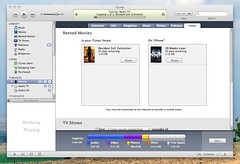
iTunes and iPhone and movie rentals: Awesomenicity!
Originally uploaded by thatjonesboy.
Is "awesomenicity" a real word? It is now - now that I have a 16Gb iPhone and I can fit all my contacts, all my calendar, all the music I need, a selection of my best photos... and a MOVIE i rented from iTunes Store in ONE CLICK!
There's only two people on this earth who could make me take the train to work instead of driving a car: AL Gore (obviously) and Steve Jobs - coz watching movies on an iPhone? I feel like missing my stop!
Uploaded with plasq's Skitch
Squarespace does the industry's shiniest graphs

Squarespace does the industry's shiniest graphs
Originally uploaded by thatjonesboy.
No doubt about it - business blogging/website host Squarespace does the shiniest site traffic graphs I've ever worked with.
See the transparent columns? That's last month's traffic, so you can see how this month compared to last month.
Lack of .CSV export is a bit frustrating though - there's no way to export the traffic data out.
Wednesday, February 20
One for the ladies (you're welcome, ladies)

if i woz a grrl, i would want to wear this! I love the "WTF" and the octopus shouting "PWWWNND!"
What's more important in a social messenger?
Tuesday, February 19
Feedback on scouta.com redesign mockup

New scouta.com Mockup
Originally uploaded by rich115.
Richard Giles from Scouta was looking on Twitter for some feedback on his new redesign. I charge for this kinda work, but here's some brief feedback:
S-P-E-L-L out the benefit
You haven't yet shown the user the benefit. You assume they know why receiving personalised recommendations is a good thing. Start with, "Who has time to find good stuff to listen to/watch online?..." and explain the benefit. Most consumers still aren't aware of what recommendation is, much less why it matters to them.
Who's your target audience?
It's really hard to get a good balance between the consumer target and the media publisher target, so why try? It just clutters and confuses to have a message aimed at publishers wedged in-between two consumer messages. Just put a button-shaped link near the bottom that says, "Are you a media publisher?" and take the publishers to another page. We media publishers are smart, we're better at retention when scanning a page than joe consumer.
What's your brand?
You've got two competing brands on the page: the "scouta" text and the whirly play button, which is really your chicklet - what should be small, subtle interface cue used before links, instead of player play buttons, etc. Which do you need the user to really recall? I'd suggest it's the Scouta logo.
Not all ratings are equal
Are you sure you want to collect user ratings on content right from the homepage with no prior Learn More or new user registation? Before they've really invested in the idea that rating things well delivers good recommendations? Having worked on content recommendation products before, not all user ratings are equal. I'd expect these ratings would be next to useless in this context, and aren't likely to give the user a positive result - they're going to expect a perfect recommendation after the first rating click, or click both of them to see what happens, or worse.
When it doesn't work as they expected (because you haven't yet told them what to expect) their simple little mind will come to the end of their tiny little attention span, they'll click off your homepage and whatever you paid the SEO to get them will be wasted.
CaPiTaLiSaTiOn!
I'm Not A Big Fan Of Capitalising Words That Aren't Actually Proper Nouns ;-) When The Whole Page Uses Them It Doesn't Focus The Eye, Instead It Decreases Readability Significantly.
25% OFF! Oh wait, it's free...
Love rosettes for highlighting 'special deal' info, though they tend to get ignored by users not interested in clicking on advertising links. They're not very 'with it' anymore. If you must use one, consider one with fewer points. If you're not wedded to a rosette but still want visual impact, nothing says "Ideal for iPod, iPhone and AppleTV owners" better than a pic of the products all nicely arranged together with some dramatic lighting and a zushy background.
Black on orange isn't kind on eyes, and, uhh... were you happy with that font?
Love the promise of personalised content recommendations, keen to see how the new site looks when it goes live! Hope that helps!
Monday, February 18
ingbank not up there for thinking

ingbank not up there for thinking
Originally uploaded by thatjonesboy.
Clearly the missing letters in "...ingbank.com.au" are not "think".
They have yet to discover that URLs can be redirected - scary! Wonder how hard it would be to take my line of credit elsewhere?...
too many windows, too many tabs

too many windows, too many tabs
Originally uploaded by thatjonesboy.
whatever this is, it isn't productivity.
When worlds collide
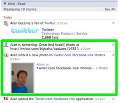
When worlds collide
Originally uploaded by thatjonesboy.
I just used Twixtr to update Twitter and Facebook. But I also have Twitter set to update Facebook. So then Twitter also updates Facebook - ick.
Thank Jebus Facebook doesn't then update Twitter. Then Twitter would update Facebook, then... aaahhh! Infinite status update loop!
Sunday, February 17
note: this is not an actual treasure map
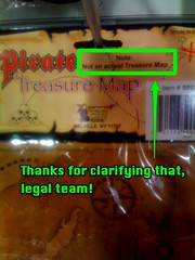
note: this is not an actual treasure map
Originally uploaded by thatjonesboy.
seen in kid's toy shop, on a toy treasure map. just in case long john silver and bluebeard walk into a toy store, buy a copy of the map, and then sue the manufacturer for lack of booty.
thanks, legal profession! you're worth the hundreds of dubloons an hour we're paying you!
Friday, February 8
Apple Australia finally adds photo printing!
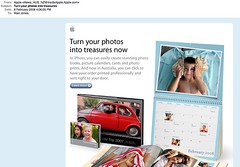
Apple Australia finally adds photo printing!
Originally uploaded by thatjonesboy.
OMG! After many years of bemoaning lack of iPhoto photo book service from Apple Australia, they've finally got it going! What does this mean for the local startups who've been benefiting from Apple's absence in this market, like Momento.com.au?
Uploaded with plasq's Skitch
Wednesday, February 6
Updated: Wow, you're 'the' Dave Morin?
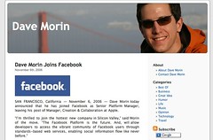
Wow, you're 'the' Dave Morin?
Originally uploaded by thatjonesboy.
[Updated: see the end of this post for the latest news on Dave]
I shouldn't judge someone by how they blog, but hey, everyone else does...
I saw a reference to Dave Morin on Valleywag today and thought, "hey, Facebook evangelist? i should look him up, maybe I can learn a few tricks from such a prominent evangelist."
Well, maybe it's just me, but I've never been a big fan of people who put a big photo of themselves in the masthead of their blog (unless they're, like, Madonna, or sumfink.) It smacks of hubris.
But that ain't nothing; hubris gets its big, hob-nailed boots on and gives you a kickin' when it sees you referring to yourself in the third person when you announce a job change in your personal blog. And date and location-ise the intro sentence so it reads like a press release? Puh-sleaze, not even Madonna does that anymore.
"SAN FRANCISCO, California — November 6, 2006 — Dave Morin today announced that he has joined Facebook as Senior Platform Manager, leaving his post of ..."
...ack, somebody tell me it's all tongue-in-cheek and I've mis-read his self-satirizing style. Please!
UPDATE: I'm always amazed by the power of the interweb to connect people across thousands of miles of ocean and fibre optic cable. Dave Morin emailed me only a few days after this post. Turns out it was all tongue-in-cheek after all, and I have mis-read his self-satirizing style. Via email he was perfectly nice, absolutely not in love with himself, and has offered to meet up with me for a coffee when next I'm in town. I've suggested he might want to make the satirical intent of his blog and his announcement a little more obvious, for those of us not clever enough to get the point. Good job, Dave.
at
Wednesday, February 06, 2008
View Comments
![]()
Labels: facebook
Tuesday, February 5
Yes We Can - Barack Obama set to music
I wish there had been a candidate in the Australian federal election who had been as inspiring as this! But America was ever a nation of bigger dreams, wider canvasses, and of late, greater disappointments.
We want change too, Mr Obama. Bring it on!
Saturday, February 2
M/20 seeks F/12 for bad time

Uh-oh, i think this may be the first reported case of a sex crime arising from use of a mobile social network product, in this case mocospace:
"A 20-year-old man has been arrested for allegedly having sexual contact with a 12-year-old girl, officials said..." from CBS4 Denver.
It's not good for Mocospace and not good for the mobile social network industry in general for this to happen. But it's somewhat inevitable when even a casual browse on Mocospace makes it pretty clear that the popular female users on the network are not popular for their writing skills.

Say goodbye to the value of your social graph
Google's released a new API that allows developers to harvest the 'social graph' - the relationships between people on the web - the links labelled 'friend', 'colleague', 'mother', between our individual online identities.
At the moment, there is no single social graph for the interweb. Instead, separate proprietary graphs exist on each of the major portals (Yahoo!, etc) and also on the major social networks (MySpace, Facebook, Bebo, LinkedIn, etc.). To a large extent, the value of these companies is tied up with the size of users graphed, the number of connections in those graphs, and the rate of growth in users and connections.
Because of the risks vs benefits involved, it seems unlikely that Google will be able to persuade players with high-value social graphs to open their data to the API very soon. Any player with a high-value social network risks contributing more value to its competitors than it receives by opening to the API. Google might be able to gain enough leverage to bring a majority in eventually.
If the industry adopts an open API for social graphing then it must also offer better tools to allow users to explicitly control what relationships are exposed, to whom, and to what level of detail. While the social graphs remain closed and proprietary the cost of unplanned exposure is still pretty low (though I continue to have a problem with the way LinkedIn exposes which other profiles have been viewed by the people who've been looking at my profile.) But if we move towards one shared social graph, it's going to be essential that you own and control it.
MSFT & YHOO: can the snake swallow the elephant?
Microsoft swallowing Yahoo! is either going to be fast and ugly, or slow and ineffective.
Good friend Goonker said it best. Referring to Steve Ballmer's quote that he feels "putting these things (Microsoft and Yahoo!) together with a great integration should be quite an accelerant to progress." Goonker says, "accelerant as in: flame out quickly?"


